在项目中,如果说什么组件用的最多。那弹窗觉得是第一个。想要一个好的弹窗,也是要花一些心思。这里从这几个方面来说。
- 展示效果好看。
- 弹窗一般分背景底色和弹窗实体。怎么做到好看呢。底色要渐变出来,底色要像子弹一样有一个圆头,刷一样出来好看。
- 弹窗实体怎么好看。可以先快速再慢速的展示出来。也可以像弹簧一样来回动弹几下出来。
- 弹出的方向可配置,背景颜色,透明度可配置。
- 弹窗实体中,内容太高或太宽怎么处理呢。
- 总之,就是要做的好看。
只有想到了才会去做到,去实现。那么就一点点实现吧。
实现过程
在实现这些效果中, css 占据了很重要的一部分。比如渐变、伸出。
实现渐变可以用 opacity、rgba。
想实现伸出弹出可以用 transform、keyframes,甚至绝对定位。
那想要一个好的弹射效果,先想到的可能会是 keyframes。它可以很精细的对目标的状态进行更改操作。可是吧,transform 可以使用 step 和 cubic-bezier(贝塞尔曲线),也可以实现弹簧的那种效果。这样实现起来就简单好多了(代码要少要少要干净),但是,觉得还是不够细腻,不够好。
先看看效果吧。
出了 css,其他就是 vue3 相关的东东了。下边直接贴出代码。
这里有个缺点,就是使用贝塞尔曲线来做弹出效果时候,底端会露白。其实,也想到了一个方法。传一个实体的背景色过来,在背景那边补上颜色也是可以解决的。
Code
popupLayer.vue
<template>
<view v-if="controller.open" class="popup-layer" catchtouchmove="true">
<view v-if="direction == 'top'" class="top-bg-color" :class="{ 'top-bg-show': controller.bg, 'top-bg-hide': !controller.bg }" :style="{ opacity: controller.bgOpacity }" @tap="close"></view>
<view v-if="direction == 'bottom'" class="bottom-bg-color" :class="{ 'bottom-bg-show': controller.bg, 'bottom-bg-hide': !controller.bg }" :style="{ opacity: controller.bgOpacity }" @tap="close"></view>
<view v-if="direction == 'left'" class="left-bg-color" :class="{ 'left-bg-show': controller.bg, 'left-bg-hide': !controller.bg }" :style="{ opacity: controller.bgOpacity }" @tap="close"></view>
<view v-if="direction == 'right'" class="right-bg-color" :class="{ 'right-bg-show': controller.bg, 'right-bg-hide': !controller.bg }" :style="{ opacity: controller.bgOpacity }" @tap="close"></view>
<view class="popup-content" :style="_location"><slot></slot></view>
</view>
</template>
<script setup>
import { reactive, defineProps, defineEmits, defineExpose, computed, onMounted, watch } from 'vue';
const controller = reactive({
open: false,
lock: false,
bg: false,
bgOpacity: 0,
translate: -100,
time: null
});
const emits = defineEmits(['onClose']);
const timingFuns = {
'cubic-bezier': 'transition-timing-function: cubic-bezier(.15,-0.88,.41,1.68);',
ease: 'transition-timing-function: easy;',
'ease-in': 'transition-timing-function: ease-in;',
'ease-out': 'transition-timing-function: ease-out;',
'ease-in-out': 'transition-timing-function: ease-in-out;',
linear: 'transition-timing-function: linear;'
};
const props = defineProps({
direction: {
type: String,
default: 'top' // 方向 top,bottom,left,right
},
bgOpacity: {
type: Number,
default: 0.38
},
timingFun: {
type: String,
default: 'cubic-bezier'
}
});
watch(() => props.timingFun, (newValue, oldValue) => {}, {
immediate: true
});
const _translate = computed(() => {
const transformObj = {
top: `transform:translateY(${-controller.translate}%)`,
bottom: `transform:translateY(${controller.translate}%)`,
left: `transform:translateX(${-controller.translate}%)`,
right: `transform:translateX(${controller.translate}%)`
};
return transformObj[props.direction];
});
const _location = computed(() => {
const positionValue = {
top: 'bottom:0px;width:100%;',
bottom: 'top:0px;width:100%;',
left: 'right:0px;top:0px;height:100%;',
right: 'left:0px;top:0px;height:100%;'
};
let style = '';
if (timingFuns[props.timingFun]) {
style = timingFuns[props.timingFun];
}
return style + positionValue[props.direction] + _translate.value;
});
const open = function() {
if (controller.open) {
return;
}
controller.open = true;
let openTimer = setTimeout(() => {
clearTimeout(openTimer);
controller.lock = true;
controller.bg = true;
controller.bgOpacity = props.bgOpacity;
controller.translate = -0.1;
openTimer = null;
console.log('_location', _location);
}, 100);
// 防止误触
let lockTimer = setTimeout(() => {
clearTimeout(lockTimer);
controller.lock = false;
lockTimer = null;
}, 500);
};
const close = function() {
if (controller.timer || controller.lock) {
return;
}
controller.bgOpacity = 0;
controller.bg = false;
controller.translate = -100;
controller.timer = setTimeout(() => {
clearTimeout(controller.timer);
controller.open = false;
controller.timer = null;
emits('onClose');
}, 600);
};
defineExpose({
open,
close
});
</script>
<style lang="scss" scoped>
.popup-layer {
width: 100vw;
height: 100vh;
overflow: hidden;
top: 0px;
left: 0px;
position: fixed;
z-index: 9999;
.popup-content {
position: absolute;
z-index: 1000000;
transition: transform 0.4s;
}
}
// 底部出来
.top-bg-color {
width: 120vw;
height: 120vh;
background: #000;
position: relative;
left: -10vw;
top: 121vh;
opacity: 0;
transition: 0.24s opacity, 0.24s top;
}
.top-bg-show {
top: 0;
}
.top-bg-hide {
top: 121vh;
}
.top-bg-color:after {
content: '';
width: 120vw;
height: 120vw;
border-radius: 50%;
background-color: #000;
position: absolute;
left: 0;
top: -30vw;
}
// 顶部出来
.bottom-bg-color {
width: 120vw;
height: 120vh;
background: #000;
position: relative;
left: -10vw;
bottom: 121vh;
opacity: 0;
transition: 0.24s opacity, 0.24s bottom;
}
.bottom-bg-show {
bottom: 0;
}
.bottom-bg-hide {
bottom: 121vh;
}
.bottom-bg-color:after {
content: '';
width: 120vw;
height: 120vw;
border-radius: 50%;
background-color: #000;
position: absolute;
left: 0;
bottom: -30vw;
}
// 右边出来
.left-bg-color {
width: 120vw;
height: 120vh;
background: #000;
position: relative;
top: -10vh;
left: 121vw;
opacity: 0;
transition: 0.24s opacity, 0.24s left;
}
.left-bg-show {
left: 0;
}
.left-bg-hide {
left: 121vw;
}
.left-bg-color:after {
content: '';
width: 120vh;
height: 120vh;
border-radius: 50%;
background-color: #000;
position: absolute;
top: 0;
left: -30vh;
}
// 左边边出来
.right-bg-color {
width: 120vw;
height: 120vh;
background: #000;
position: relative;
top: -10vh;
right: 121vw;
opacity: 0;
transition: 0.24s opacity, 0.24s left;
}
.right-bg-show {
right: 0;
}
.right-bg-hide {
right: 121vw;
}
.right-bg-color:after {
content: '';
width: 120vh;
height: 120vh;
border-radius: 50%;
background-color: #000;
position: absolute;
top: 0;
right: -30vh;
}
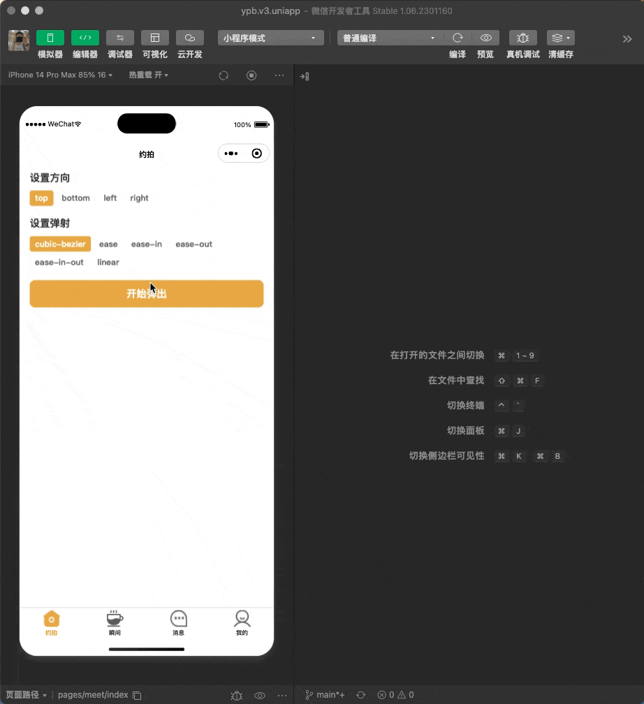
</style>测试调用的临时 vue
<template>
    <view class="d-flex flex-column w-100">
        <view class="flex-column mt-10 px-30">
            <view class="text-color-3 text-size-30 font-w600">设置方向</view>

            <view class="d-flex align-items-center flex-wrap mt-10">
                <view v-for="(item, index) in directions" :key="index" class="mr-10 mt-10" hover-class="hover-opacity" @tap="setDirections(item)">
                    <view class="d-flex px-16 py-6 border-radius-8 flex-shrink-0" :class="{ 'bg-color-1 text-color-2': item == popupOption.direction, 'bg-color-2 text-color-4': item != popupOption.direction}">
                        <view class="text-size-26"> {{ item }} </view>
                    </view>
                </view>
            </view>

            <view class="text-color-3 text-size-30 font-w600 mt-30">设置弹射</view>

            <view class="d-flex align-items-center flex-wrap mt-10">
                <view v-for="(item, index) in timingFuns" :key="index" class="mr-10 mt-10" hover-class="hover-opacity" @tap="setTimingFuns(item)">
                    <view class="d-flex px-16 py-6 border-radius-8 flex-shrink-0 action-item" :class="{ 'bg-color-1 text-color-2': item == popupOption.timingFun, 'bg-color-2 text-color-4': item != popupOption.timingFun}">
                        <view class="text-size-26"> {{ item}} </view>
                    </view>
                </view>
            </view>

            <view hover-class="hover-opacity" class="bg-color-1 text-color-2 text-size-30 border-radius-16 py-20 mt-30 d-flex justify-content-center" @tap="doPopup">开始弹出</view>
        </view>
    </view>

    <popupLayer ref="layer" :direction="popupOption.direction" :timing-fun="popupOption.timingFun" @onClose="onClose">
        <view class="box-shadow-sm" :class="boxClass"></view>
    </popupLayer>
</template>

<script setup>

import { ref, reactive } from 'vue'

const popupOption = reactive({
    'direction': 'top',
    'timingFun': 'cubic-bezier'
});

const directions = ['top', 'bottom', 'left', 'right'];

const timingFuns = ['cubic-bezier', 'ease', 'ease-in', 'ease-out', 'ease-in-out', 'linear'];

const layer = ref(null);

const boxClass = ref('bottom-box');

const setDirections = function(value) {
    popupOption.direction = value;

    boxClass.value = { 'bottom': 'top-box', 'top': 'bottom-box', 'left': 'right-box', 'right': 'left-box'}[value]
}

const setTimingFuns = function(value) {
    popupOption.timingFun = value;
}

const doPopup = function() {
    layer.value.open()
}

const onClose = function() {
    console.log('close')
}
</script>

<style>
    .bottom-box {
        width: 100%;
        height: 520upx;
        border-top-left-radius: 20upx;
        border-top-right-radius: 20upx;
        background-color: #ffffff;
    }

    .top-box {
        width: 100%;
        height: 520upx;
        border-bottom-left-radius: 20upx;
        border-bottom-right-radius: 20upx;
        background-color: #ffffff;
    }

    .left-box {
        width: 520upx;
        height: 100vh;
        border-top-right-radius: 20upx;
        border-bottom-right-radius: 20upx;
        background-color: #ffffff;
    }

    .right-box {
        width: 520upx;
        height: 100vh;
        border-top-left-radius: 20upx;
        border-bottom-left-radius: 20upx;
        background-color: #ffffff;
    }
</style>
关于测试用的 vue,里边用到了很多 class,这些 class 都是全局定义好的。足够规范和足够包容就可以少写很多样式了。这样,有一个缺点就是 html 部分特别长。这就是组合起来的好处和缺点。也贴出部分代码。
base.scss
// 布局相关的样式
.d-none {
    display: none;
}

// flex 布局(全用 flex 布局)
.d-flex {
    display: flex;
}

.d-inline-flex {
    display: inline-flex;
}

.flex-row {
    flex-direction: row;
}

.flex-row-reverse {
    flex-direction: row-reverse;
}

.flex-column {
    flex-direction: column;
}
……
// margin
$list: 6 8 12 16 24;

// left
@each $i in $list {
    .ml-#{$i} {
        margin-left: #{$i}upx;
    }
}

@for $i from 1 to 5 {
    .ml-#{$i * 10} {
        margin-left: #{$i * 10}upx;
    }
}

// right
@each $i in $list {
    .mr-#{$i} {
        margin-right: #{$i}upx;
    }
}

@for $i from 1 to 5 {
    .mr-#{$i * 10} {
        margin-right: #{$i * 10}upx;
    }
}

// x
@each $i in $list {
    .mx-#{$i} {
        margin-left: #{$i}upx;
        margin-right: #{$i}upx;
    }
}

@for $i from 1 to 5 {
    .mx-#{$i * 10} {
        margin-left: #{$i * 10}upx;
        margin-right: #{$i * 10}upx;
    }
}

$num: 12;
@while $num < 54 {
    .text-size-#{$num} {
        font-size: #{$num}upx;
    }
    $num: $num + 2;
}

$num: 6;
@while $num < 30 {
    .border-radius-#{$num} {
        border-radius: #{$num}upx;
    }
    $num: $num + 2;
}
还有 css 的变量写法也要用起来。好东西就要用起来,有了变量,才算是真正的程序啊,哈哈。
root: {
--bg-color: #f00;
}
span {
background: var(--bg-color)
}
最后
其实,这里没有对超过宽度或超过高度的处理。这里仅仅是个弹出的工具,仅仅做弹出而已。实体部分都由插槽交给需要用到的地方。
如果真遇到宽度或高度超过的情况,可以套一层 scroll-view 组件。如果实体内容具有可变性,就是有时候会高一点有时候会矮一点(数据驱动ui,数据来源服务器),这个时候给 scroll-view可以加个约束,比如 max-height:calc(100vh - 100px),具体多少,试着来。
相关文章
https://developer.mozilla.org/zh-CN/docs/Web/CSS/transition-timing-function
https://zhuanlan.zhihu.com/p/397089242
https://cubic-bezier.com/#.23,-0.47,.44,1.65